The National Council for Geographic Education asked me to design a new look for their textbook covers as well as a separate logo for their Applied Teacher Materials brand. They wanted something that could change colors by subject but retain an instant visibility as one of their collection. They wanted it to be an evolutionary from their last series of book artwork, but with a much more artistic approach. The challenge didn’t stop there! They wanted a common element that could be completely changed based on the subject matter.
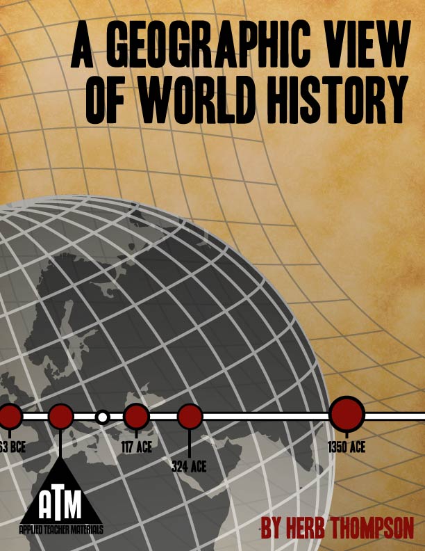
Here is how I approached the design. I started by building and laying down the globe and the grid, since they were an essential element in all their other previous pieces. I decided to create a “stripe” across the design that could be themed by book (on this first title I did a timeline with actual dates from the lesson plans inside) that could be switched out based on the theme. Once I had the formula down, I read up on the author, Herb Thompson. Herb is a modern Indiana Jones, so I dropped in the subtle parchment at the back and used warm tones to create that “Indiana” vibe.
I based the ATM logo on a pyramid, not only because of Herb’s photo (which did initially spark the idea), but also as an educational model representing all levels of learning.
They dug it – I am currently contracted to create eight more titles in the series for them and will share them as they are published so you can see the full arc of the series.


